
Responsive web design empowers your website to adapt itself to the device your users are viewing it on. The site layout changes dynamically, based on the size of the screen and capabilities of the device. Until recently, responsiveness was a bonus, but now it’s an essential part of good web design!
In this blog article, we’ll introduce the basics of responsive web design, explore the design principles that make a site responsive. If you are a beginner exploring this concept, the basics covered here should help you to get started. Create your own web page that works on multiple devices – Desktop, Mobile or Tablet!
What’s Responsive Web Design And Why Is It Important?
If you’re creating a website, you should be aware that your viewers might access it from a variety of devices with varying screen sizes. There’s a growing number of web browsers using their mobile phones or tablets to view web pages.
In the example below, the website has been designed to be responsive. As you can see, the layout and contents adapt to display according to the screen size and resolution.
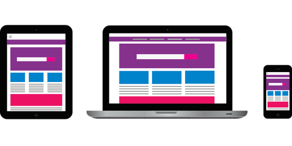
If your site isn’t responsive, the content will not be well laid out on a screen with constrained display size. Therefore, it’s essential that your web page layout can adapt to suit the device.
Is It Just About Various Screen Sizes?
The goal is not just to make them flexible but also adaptive to the device that renders your web pages. Screen size is the primary factor, but there are other considerations too, like the display pixel density, whether it’s touch-screen, etc.
Your aim should be to design a website that works well on any device regardless of the viewport dimensions, resolution or how the user interacts with it. You should plan and create the layout, your media and even the navigation for the best usability on every device.
Ethan Marcotte – Father of Responsive Web Design
When you hear about responsive web design, you may be inclined to think of it as a design standard or technology. However, the term isn’t any of that. It refers to a set of design principles that you should adhere to while creating your web pages, to make them fluid.
Ethan coined the term and laid down the principles, and is popularly known as the father of responsive web design. Ethan Marcotte came up with a design principle that uses CSS cleverly to render the same web page on different screen sizes, without affecting its readability or usability.
Three Basic Ingredients Of Responsive Web Design
Using CSS Media Queries To Customize Styling
In the past, web designers were dependant on “User-Agent sniffing” to dynamically serve different HTML/CSS code or rely on URL redirection. CSS3 introduced a new technique called “media query.”
Using the @media rule, you can include a specific block of CSS properties after verifying for a certain condition. You can check the following conditions:
- Viewport Width/Height
- Device Width/Height
- Orientation (Portrait/Landscape)
- Resolution
You can check the conditions and use media queries to deliver specific styling blocks, according to the device type.
Syntax For Media Query
@media not|only mediatype and (expressions) {

CSS-Code;

}
Example Media Query
There are plenty of examples and a handy “Try It Yourself” editor, available on the W3Schools website.
In the example below, @media query is used to check if the viewport width is 375px or more. If it’s more than 375px, the menu will be displayed above the content and if lesser than 375px, the menu will float to the left.
@media screen and (min-width: 375px) {

#leftsidebar {width: 150px; float: left;}

#main {margin-left:220px;}

}
Fluid Grid Based Layouts
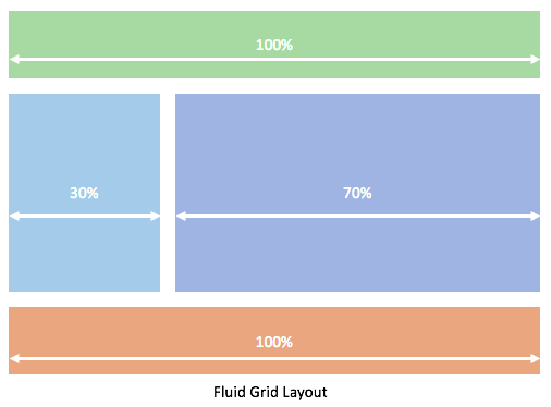
The term “Fluid Grid” describes a layout in which instead of using fixed pixel values, you code them all in relative proportions of the other elements. As a result, the components flow (fluidity) and adapt to the device.
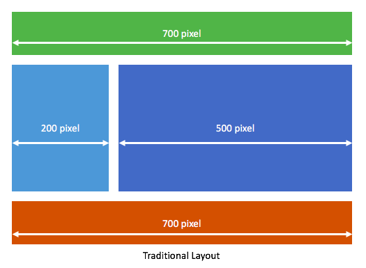
In traditional layouts, you would be positioning the elements using fixed width grids. However, we are now dealing with a wide range of screen sizes. Such an approach will lead to your websites looking badly laid out. Let’s have a look at an example of traditional CSS layout approach:
The Fluid Grid approach makes use of “relative proportions,” i.e., you would code the height and width of each element as a percentage or relative size. In the example below, the components are sized using a “percentage” approach:
Fluid Images
In a responsive web design approach, you should use CSS to define a maximum width for all images but not a minimum width.
By specifying a maximum width, you’re ensuring that the image will never get pixelated beyond a value that will affect its quality of appearance. By not defining a minimum width, you are allowing CSS to shrink the size to any value (required to fit within the context).
CSS maintains the aspect ratio, and therefore your image will look not stretched.
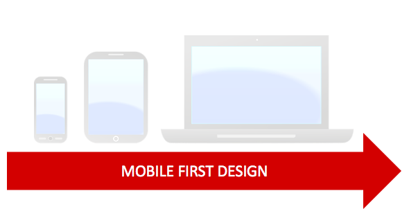
Mobile First Design
Mobile usage has surpassed desktop usage in 2017. As of today, StatCounter reveals that 50.87% users browse from mobiles as against 44.78% from desktops.
This increase in mobile usage means designers should pay extra attention to how their websites will look on mobile screens. Therefore, more and more designers are following the “mobile first” rule while designing.
“Mobile first” is a design methodology which suggests that you start designing the website to look its best for mobile (because it has the most restrictions), then expand to tablets and finally desktops.
Testing Your Design – Simulate And Study
You’ll find plenty of tools online to simulate the various requirements of different devices and test your website. When you’re designing a responsive site, you should use such tools to simulate and test your website’s look and behavior on various devices.
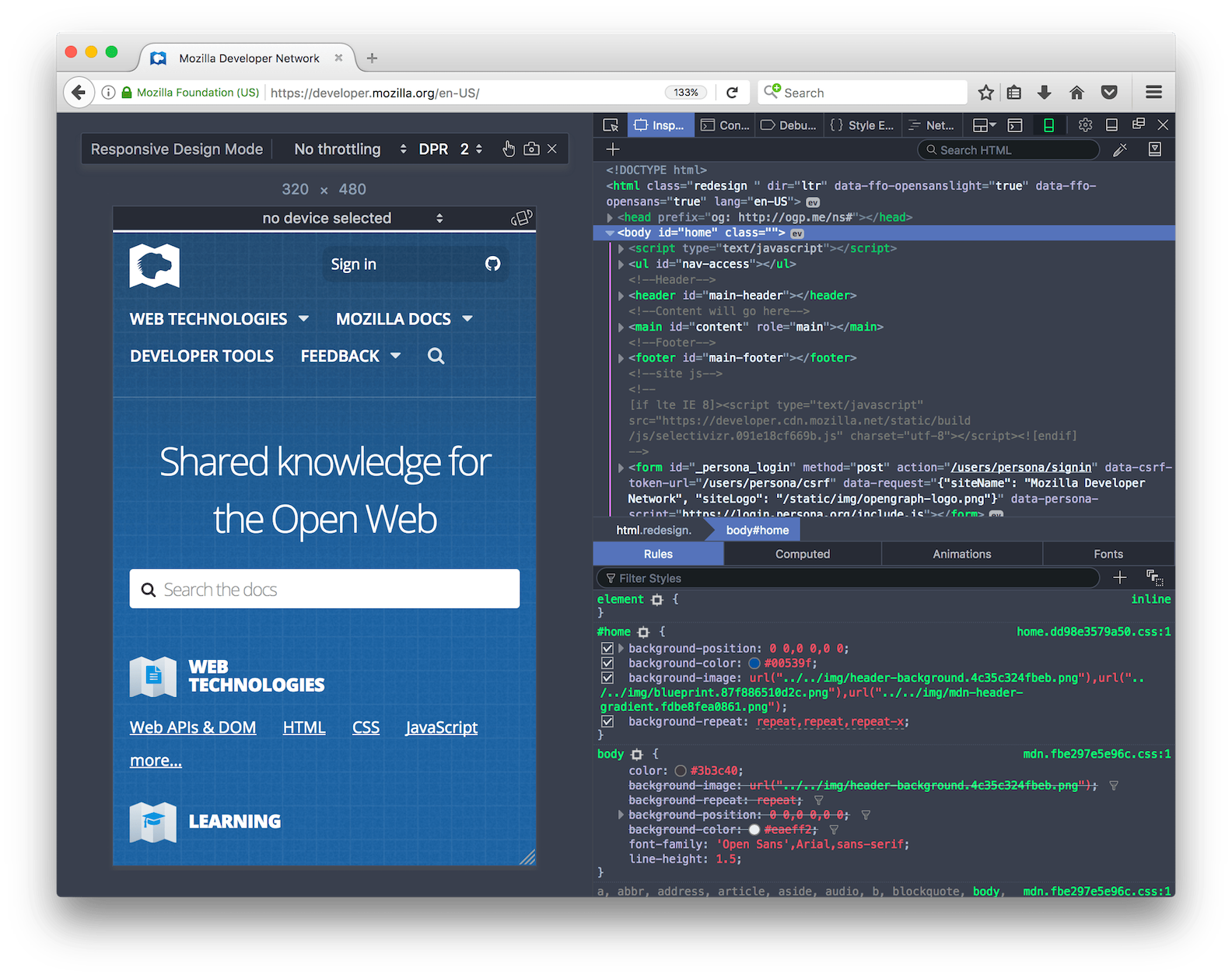
Firefox Developer Tools – Responsive Design Mode
Firefox offers a developer tool to toggle Responsive Design Mode on/off. When enabled, you can set the content area to a specific screen size, as shown in the figure below. You can simulate various sizes and test your web page.
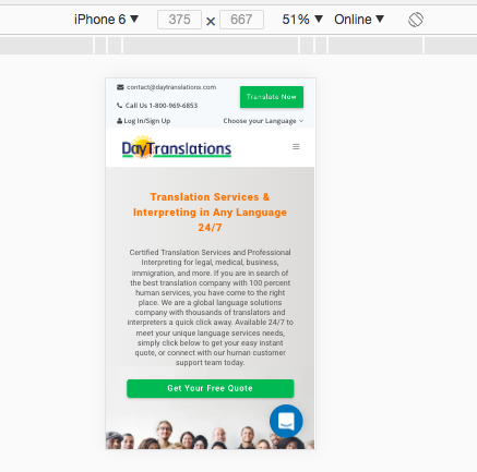
Chrome DevTools – Device Mode
If you prefer Chrome DevTools, use Device Mode to simulate a wide range of screen sizes and resolutions. Test your web pages with Device Mode enabled, ensuring that you are building a fully-responsive website.
The tool is very powerful and also lets you emulate geolocation coordinates, simulate device orientation. You can also emulate a variety of browsers to test how your web page will appear/behave on other web browsers.
If you need assistance with responsive web design, DayDigital can help you! We have helped several businesses build stunning websites and mark their online presence. Contact us now for a free consultation!